Deciding to have a publishing brand is one thing, but finding a logo is quite another. Where does one start? For us it had to be something of our natural world and, because the artwork would be created in-house, the subject needed to be a joy to bring into existence. Some of our debate took place in the far North-West of Scotland where we watched the birds of its wild coast. By some psychic unity of agreement, the European shag (Phalacrocorax aristotelis) became our favourite choice.
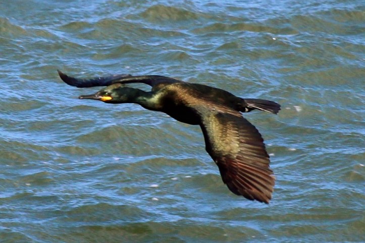
photo Paolo Oprandi
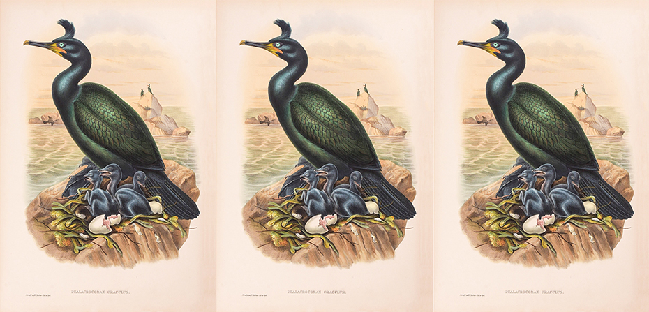
The shag’s lines, in breeding plumage, have a regal symmetry and its crested head is both reptilian and very Viking. Our research threw up some classic illustrations, one of which, by John Gould 1804-1881, a hand-painted lithograph in Birds of Great Britain published between 1862 and 1873, showed its original Latin scientific binomial as Phalacrocorax graculus. Graculus! – a superb name.

John Gould
The etymology of graculus is a compound of words meaning ‘the little croaker’. With the shifting tides of scientific classification, the name was reassigned to one of the crow species, the Alpine chough, which now goes by the name Corvus graculus. However, we were dead set on our logo and name. The final decider was our remembering Noggin the Nog, a favourite childhood animation, in which appeared a big green garrulous bird, Graculus.
The Graculus Publishing name sits neatly with the final logo illustration – a European Shag silhouette in breeding plumage, tuft-crowned head turned in observation of the world.
